How to Design Web Pages for Conversion: Form Should Follow Function
We’ve all encountered a website that looked like it belonged in a modern art gallery. Sleek images, probably in grayscale. No obvious menu or buttons. A few headlines, seemingly placed at random.
Unless you were strongly committed to buying from this business already, there is a good chance that the next thing you did was hit your browser’s back button and continued your Google search.
Design is an essential component of maximizing your website’s conversion rate and there are a few time tested principles to follow. This article will talk about the dos and don’ts of design and show you how to get a website that generates more conversions and increases your revenue!
Why Design for Conversion?
First, let’s just quickly address the elephant in the room: conversion. While lots of marketers love to talk about designing web pages for search engine optimization (SEO), the reality is that search engines don’t buy your product or service – people do.
Conversion rate optimization (CRO) is the process of designing a website which speaks to your customer directly, addresses their needs, and makes it easier for them to say yes. The benefit of improving your pages’ conversion rate is huge, as most advertising campaigns are pay per click (PPC). This means that an ad campaign that generates 1000 clicks costs the same regardless of whether or not your landing page makes 1 sale or 100 sales!
Boosting your conversion rate is a surefire way to improve your advertising return on investment. And, of course, a higher conversion rate is also going to pay dividends when it comes to organic traffic or traffic from newsletters, word of mouth, or other marketing channels!
Designing for Conversion Rate Optimization
Form Should Follow Function
As we alluded to at the top of the page: leave avant garde artistic design to artists. Your website is an employee that works 24/7 to make sales and should be structured accordingly.
Avoid artistic choices which make it harder for your customers to figure out where to click, or which add unnecessary steps to the conversion process.
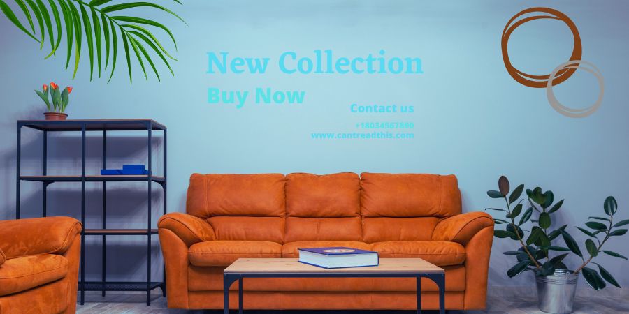
Contrast is Good
Blue text on a pale blue background might look demure and grayscale images might seem sophisticated, but at the end of the day low contrast text is less legible and low contrast images are less engaging.
This doesn’t mean that there is never a role for low contrast – but you should use it with care as it deemphasizes the image’s subject.
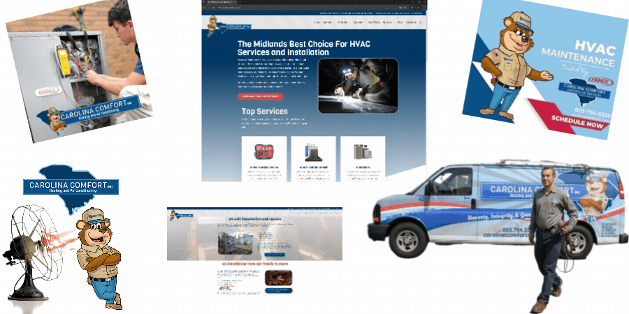
Choose a Cohesive Design and Stick to It
Just like your business’s core value propositions should not change from one set of copy to another, your basic design language should not change from one page to the next!
Your customers should never wonder if a link has taken them somewhere unexpected. Stick with a consistent color palette and basic layout so your customers aren’t given reason to wonder if they’re in the right place.

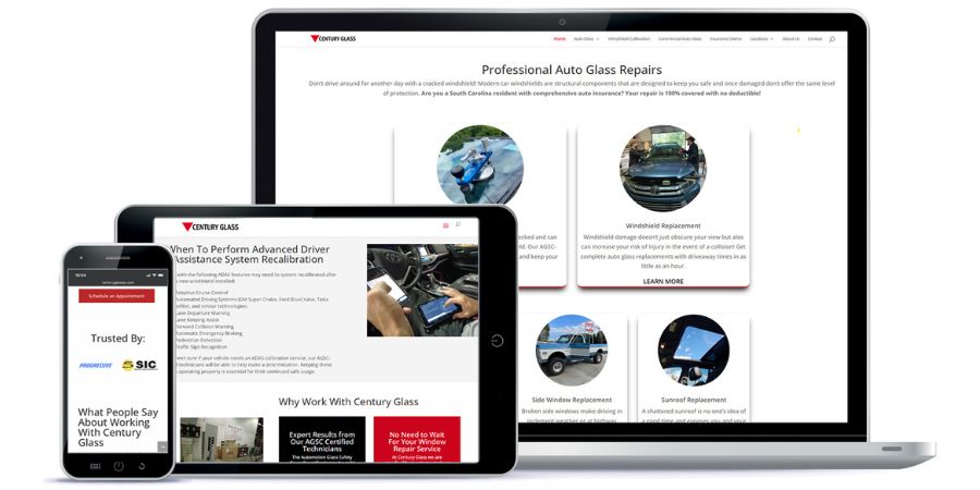
Images Should Make Sense
Just as the text on your page should focus on your products and their value propositions, so should your images. “Decorative” images don’t help with conversion and may distract readers from your message.
Abstract representations can be used – for example pictures of cardboard product boxes for downloadable software – but take care not to use images which are unclear or misleading.
All Pages Should Have a Singular Purpose
Every page should be focused around a single goal. While your homepage may include a phone number or contact box for customers, its purpose is to get your prospects to the landing page that matters most to them. Once your customer is on a landing page they should have one clear call to action available to them.
Whether this is watching a product demonstration video, requesting more information, or purchasing your product is up to you… but ideally the page should push customers to do only one of these things.
Don’t Be Afraid to Mix Up Your Calls to Action
While every landing page should have a single objective, the text related to the call to action can, and perhaps should, vary. Instead of saying “Call now” in every single CTA button, you could include a mix* such as:
- Get Started
- Call Now
- Speak with An Expert
- Request a Quote
Each of these examples aligns with a slightly different customer perspective and having a variety can ensure your message resonates with the largest audience.
*Note: all of these buttons should proceed to the same outcome!
Use Short Paragraphs, Bullet-Points, and Headlines
People don’t read websites from top to bottom in one unbroken sequence. Instead, our eyes jump around the page in a process known as saccades. These jumps ‘explore’ the page, scanning for relevant information.
However, information presented as a single monolithic block of text makes it hard for this process to unfold naturally. As a result, both attention and comprehension fall – making your point less salient and less effective.
Instead, use short paragraphs and emphasize your key points with bulleted lists and relevant headlines.
Remember to Design for Mobile
A simple fact is that we design websites on computers. This makes sense – as computers are the best tool for web design. However, this sometimes gets us thinking in a box – and we assume that our customers will be viewing our websites on computers.
However, for many industries your visitors will predominantly be using their phones to access your website. This means that spending lots of time and energy designing elaborate multi-column websites with information arrayed right to left may completely miss its mark!
Now, it should go without saying that all websites need functional mobile versions – but even a cursory search online will reveal many businesses that somehow have missed this memo!

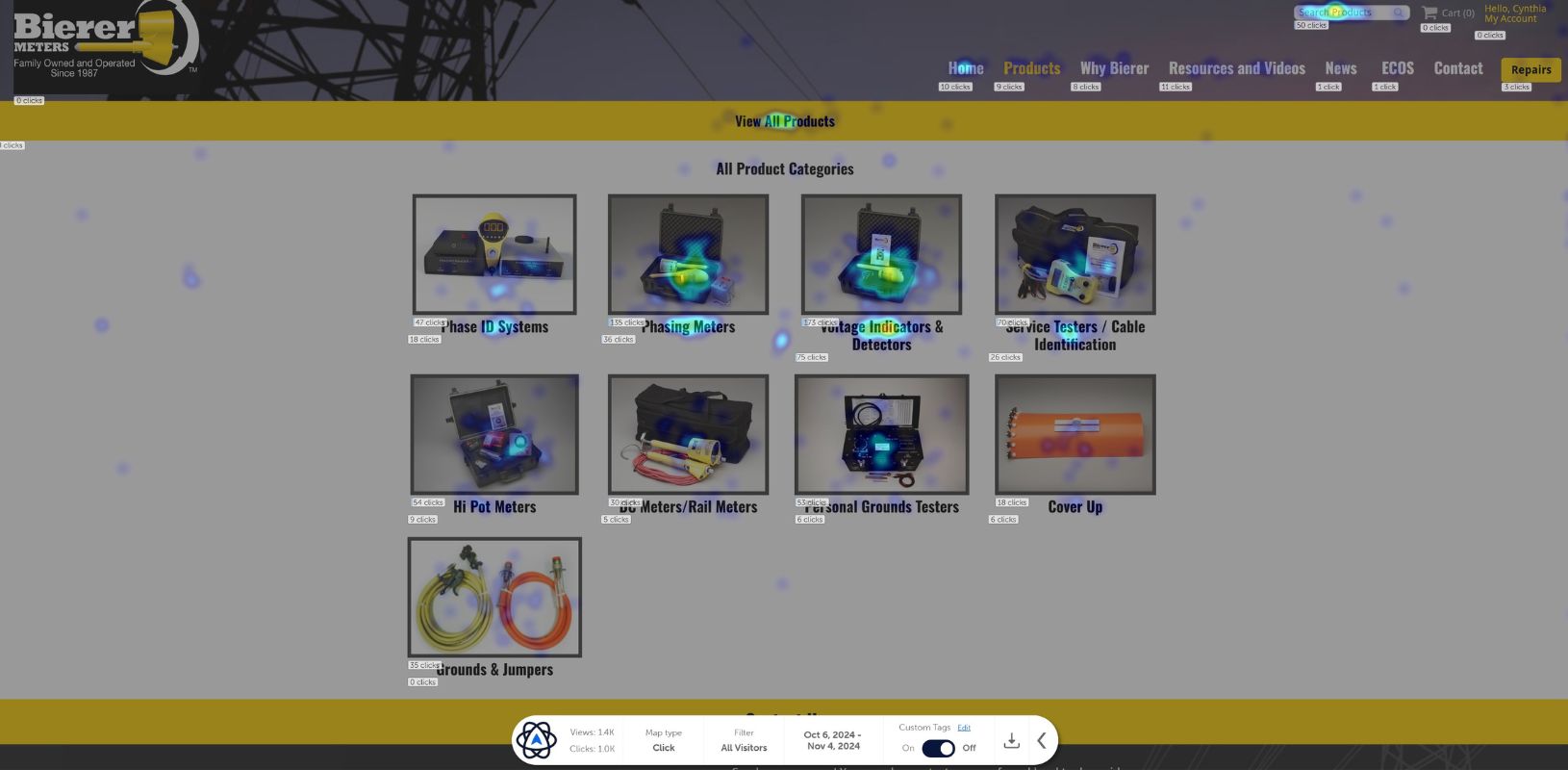
Using Metrics and Testing to Improve Web Design
It is easy to choose a particular layout, color scheme, or microcopy for a call to action button – but how do you know if that is truly the best? The answer is by tracking performance metrics and testing.
When it comes to monitoring metrics, this isn’t limited to simply tracking raw conversions, but can include more advanced metrics like mouseflow and scroll heatmaps. These techniques reveal areas where prospects are unexpectedly dropping out of the lead funnel and offer insights into what needs improvement.
Another option is A/B testing. This can be done in a variety of ways. One easy option is to simply use a particular call to action on some service pages and a different one on another. After a defined time period, identify which CTA works best and implement that sitewide.
Other more robust A/B testing methods include presenting some users with one version of a page while others get a second version. This lets you see in real time how small design changes are impacting KPIs like view time, bounce rates, and conversion rates for the exact same product or service.
Boost Conversion Rates with Good Web Design
Good web design isn’t just about aesthetics – it’s about guiding your customers seamlessly toward taking action.
By applying the principles we’ve discussed, such as keeping design functional, maintaining consistency, using strong contrast, and focusing on a singular purpose for each page, you can create a user-friendly experience that facilitates conversions. Testing and optimizing based on real data will help further refine your approach.
Remember, a conversion-rate optimized site will be your company’s most valuable employee, working 24/7 to generate more conversions and increase your revenue.